Project Overview
The Problem
Residents do not know of local produce markets due to lack of information and access to it. Residents want fresh produce from locally sourced markets but have no way of finding them.
Goals
Goal is to create an easy to use responsive website that helps people locate local produce markets in their area.
The Product
El Pueblo us a local produce marketplace in Puerto Rico. El Pueblo uses its mobile app to showcase it produce and other local produce markets that are close to the customer.
My Role
UX designer leading the app and responsive website design fro conception to delivery
Responsibilities
Conducting interviews, paper and digital wire framing, low and high-fidelity prototyping, conducting usability studies, accounting for accessibility, iterating on designs, determining information architecture, and responsive design.
Project Duration
September 2021-November 2021
Understanding the user
I conducted interviews and created empathy maps to help me clarify the needs of customers that I am designing for. One of the man groups of people had the same issue, many of our users had no updated information and had no way of accessing it to find out whether there was a produce market in their area or not. Having fresh produce is vital to the well-being of people on the island. Collecting the data from all of the interviewees confirmed a need for a responsive website for access to fresh produce.
Personas & problem statements
Pedro is a local shop owner who needs access to fresh fruits and vegetables because he has no way of locating a vendor and he wants to live a healthy life.
Competitive Audit
An audit of a few competitor’s products help give direction on where to focus my designs addressing issues to fix and new functions to create within the app and website
Ideation
I did an ideation exercise and came up with some ideas based off of the competitive audit. I focused on a live tracking function to with delivery times. This will help compete with larger box brands.
Starting the design
Digital wireframes
After I did some ideating and designing some paper wireframes I designed my first screens which focus on locating locally sourced produce.
Usability study findings
To prepare for testing, I created a low-fidelity prototype which you can view here. I used this prototype to conduct an unmoderated usability study with 4 participants. Here are the main findings uncovered by the usability study:
Fresh Food
People want access to fresh fruits and vegetables and added options to buy different amounts
2. Add different payment options
People had difficulty adding a payment to website and option to save for future purchase.
3. Map
People would like to know how near a produce market is to them.
Refining the design
Mockups
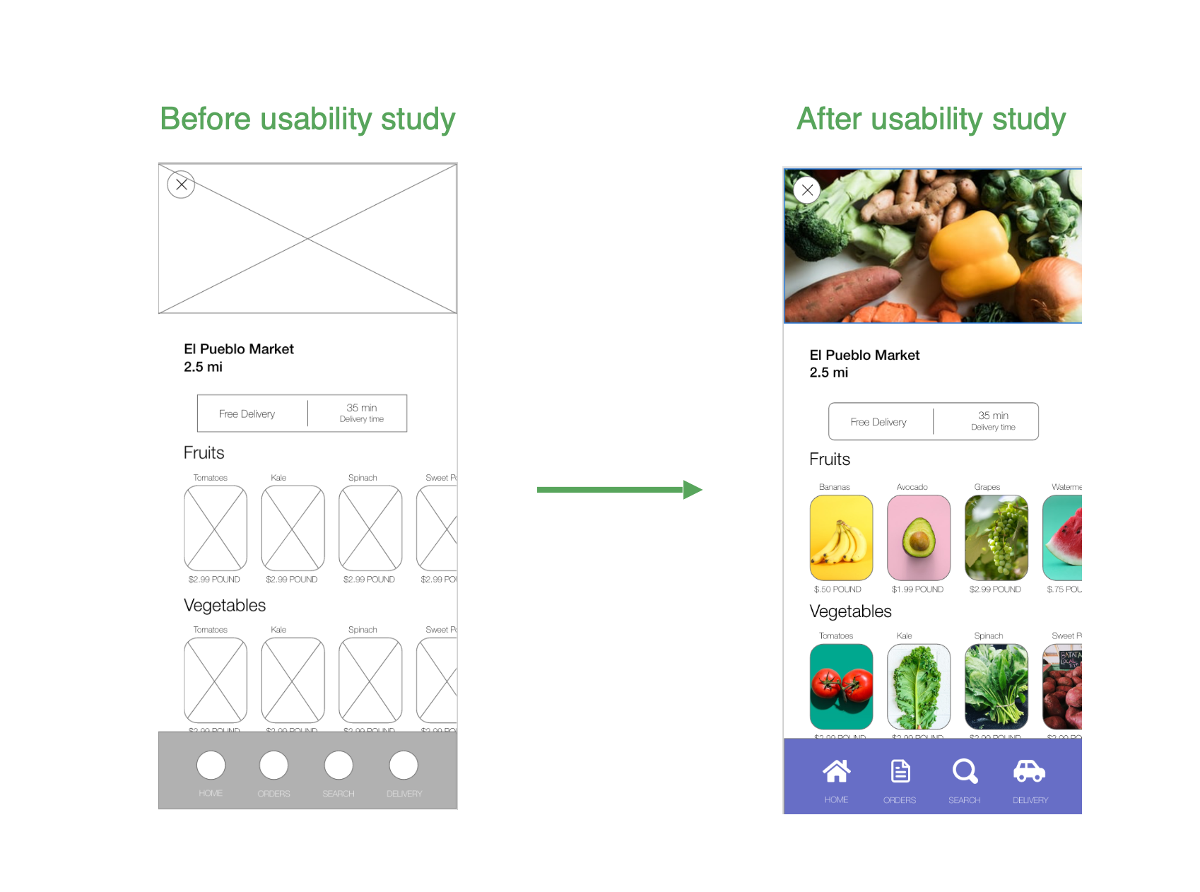
Based on my insights from the usability studies, I added the changes like adding icons and a cleaner display.
Some additional design changes such using full resolution pictures and accessibility features such as large photos and large fonts and icons.
Accessibility considerations
Screen readers
Clear labels for interactive elements that can be read by screen readers
2. IA
Initial focus of the home screen on personalized recommendations help define the primary task or action for the user.
Redefined designs
High-fidelity prototype
My high-fidelity prototype followed the same user flow as my low-fidelity prototype and include the design changes recommended on the usability study.
view the high-fidelity prototype El Pueblo Produce Market
Sitemap
Users wanted an easy to navigate responsive website, so I used that data to create a sitemap. My goal was to make strategic information architecture decisions that would improve overall navigation of the design. I chose to make the design easy to use
Responsive designs
The designs for the screen variation included mobile website, tablet and desktop. The designs were tweaked to fit users needs on different devices.
Going forward
Takeaways
Impact:
Users were able to find produce markets in their area thanks to the app that was created. One quote from a peer feedback was “having access to an easy to use app will help people make healthier eating habits.”
What I learned:
I learned that creating responsive designs for
social good is fulfilling and necessary. Helping others access life saving resources will be my focus.
Next steps
I will conduct another usability study round to help reaffirm the designs I have created and update if necessary
2. I will add more accessibility functions to all my designs.


